content

Typography

A companion site to the book On Web Typography by Jason Santa Maria.

Home Evaluating Typefaces Typographic Systems Composition History Back to Portfolio Website

Chapter 6: Composition

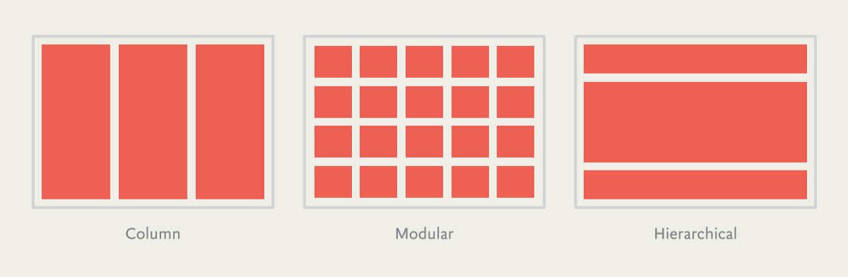
In this chapter, we’ll continue exploring how content elements within a design affect one another and how the nature of the medium itself shapes our designs. Whatever path we embark on, composition of our layout and typographic systems needs to take our medium’s constraints into account.


Known Unknowns

  • Websites and books are similar in that they both use a process while thinking of restraints and audiances
  • In websites, the device that the person is using must be minded
  • Screen resolution and browser should be considerd as well

Composing the Page

content
  • Use grids to create a clean looking layout for your website
  • At first glance, it appears as if using grids in a time where responsive design rules is foolish. But it’s not restrictive
  • A grid allows you to frame your layout with purpose

Typographic Color

content content
  • All type has typographic color
  • Typographic Color comes from things like shapes and typesetting
  • Finding balance is key. If you’re having trouble, try adjusting the hue of the type

Typographic Scales and Rhythm

content
  • You can either “eyeball it” or use a styling scale for type
  • Typographic scales are used to find a “pattern” like in music or golden ratios
  • Start with a base size for a font, then create a ratio to accompany it