Typography
A companion site to the book On Web Typography by Jason Santa Maria.
A companion site to the book On Web Typography by Jason Santa Maria.
In this chapter, we’ll look at some of the structural patterns in typefaces and see how they’re grouped and sorted. Then, we’ll examine what makes typefaces look the way they do from a visual and a technical perspective.
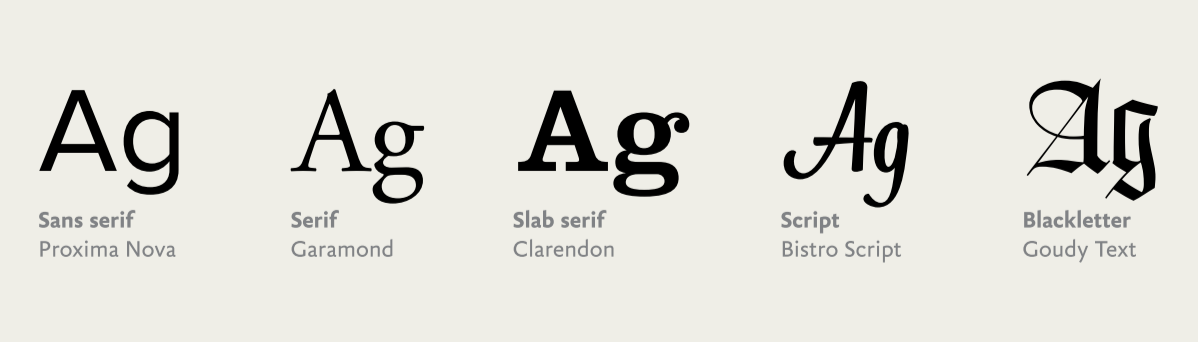
All typefaces fall into some sort of classification. Defining a classification system that comfortably accommodates typefaces from 500 years ago as well as five months ago—and getting everyone to agree on it—is notan enviable task. Fortunately, a foundation has settled enough for us to build on.
While each classification evokes a kind of feeling, it’s rarely something you can grab hold of because of how broad the classifications are. Two given typefaces may belong to the same class but spark very different responses, depending on their intended use or when they were made. Look to the typefaces themselvesto support a feeling or mood in your design.
While not comprehensive, these working classifications help me sort typefaces against a mix of physical attributes and usage. For example, decorative isn’t just a synonym for fancy type; it describes the context for using a typeface. A decorative typeface could have serifs or be a script or monospaced, but its overriding characteristics likely prevent it from everyday use.
Classifications are helpful in the same way knowing about the history of jazz or rock ’n’ roll can make you a better musician: they allow you to sort typefaces across criteria and find aesthetic and mental connections to help communicate your design. Sometimes these links are interesting juxtapositions or cultural references.
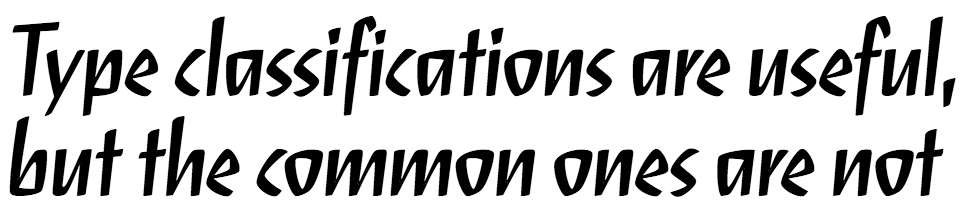
Indra Kupferschmid covers classifications in detail and proposes a more flexible system for the future in “Type Classifications Are Useful, But the Common Ones Are Not” here. Knowing about classifications makes you a better designer, because you can traverse these connections and use them to your advantage.
Classification is only one facet of why a typeface may look and feel a certain way. But what causes some typefaces to appear larger than others when set at the same size? What causes them to feel lighter or heavier? And what makes the same letter look different from one typeface to another? The answers to these questions will help you understand the visual differences between typefaces. Understanding these traits lets you trace the varied ways typefaces approach and solve the same problems. Typefaces are specialized tools, but they’re also the expressive creation of a typeface designer. Some of the choices those designers make when creating a typeface may be based on a personal preference or technical reason.
Similar to classifications, a working knowledge of these traits gives you the power to speak confidently about typography—and helps you make mental connections between typefaces that share traits.
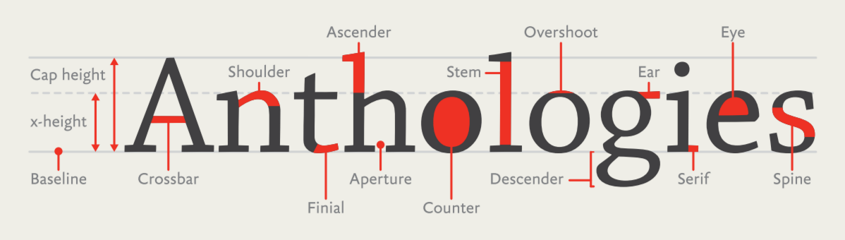
All letterforms are made up of a variety of strokes, a general term for most parts of a letter. Typefaces whose strokes vary in width to several degrees, from hairline thin to very broad, are known as high-contrast. Typefaces whose stroke widths are consistent throughout are monoline designs. Some strokes are straight and long, like the stem on a lowercase h or the descender on a p, while others are short and curved, like the neck and ear on a two-story g. Some strokes resolve in serifs, while others, as you sometimes see in the top hook of an f, can end in a bulbous shape as a ball terminal or a teardrop shape as a lachrymal terminal. Some strokes encase whitespace in what’s called a counter, like the inside of an o.
Understanding the vocabulary of type helps you discover why a typeface looks the way it does, when or where it comes from, and its intended purpose. And greater knowledge of your tools means you’re better equipped to make good decisions. Later in this chapter, we’ll take a closer look at two familiar typefaces, Helvetica and Georgia, to see how we can extend this vocabulary to new typefaces.