Chapter 5: Typographic Systems
In this chapter, we’ll explore how content elements within a design affect one another and how the nature of the medium itself shapes our designs.
Hierarchy and Contrast
- Size is one way to achieve hierarchy, but you could also do so with color or placement; the real heavy lifting happens when you combine two or more of these properties.
- Contrast instantly forges connections and distinctions between elements and, when used in concert with other tools like a grid, it helps our viewers discern what’s vital, what’s related, and what’s not.
- Without contrast, everything on a page may appear similar in size and importance, leaving a viewer the choice of either reading and decoding every bit of information or bouncing away to look at adorable cat GIFs.
Paragraphs
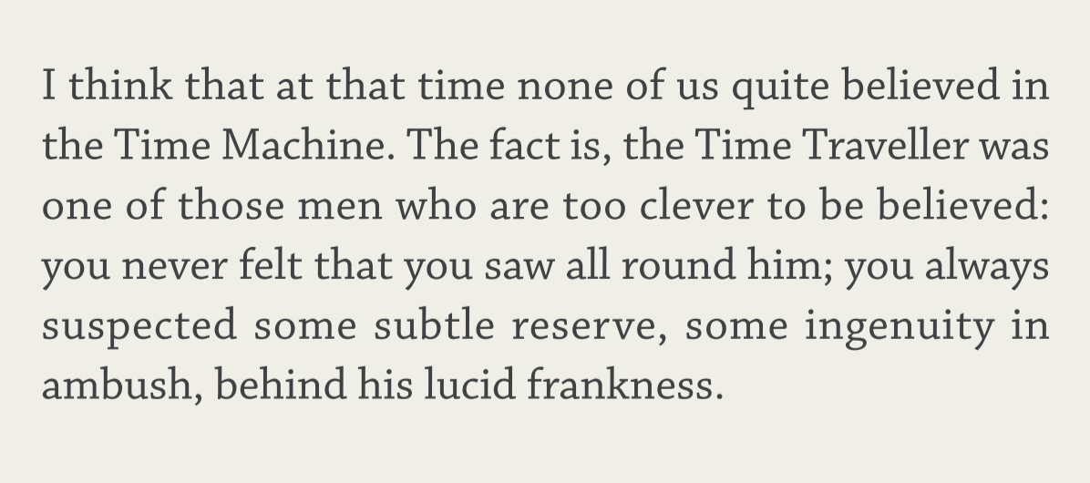
- Typefaces with less flourish and a uniform shape make for pleasing reading experiences, as they fade into the background and let the text take center stage.
- Less is usually more—we’re not looking to impress anyone with our paragraph styles.
- Where we eventually end up with our paragraph style depends on other factors like intended use, device size, alignment, and more.
Interface
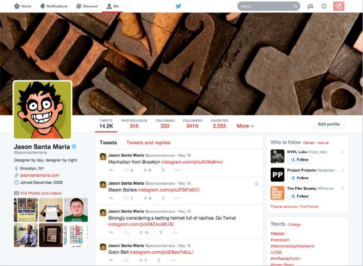
- User interface (UI) refers to elements that enable actions and give context within a website or app. Common UI components include site navigation, buttons, form elements and labels, status messages, account links, and anything in between.
- These elements serve a dual purpose: like paragraphs, they’re content, but like headlines, they may be set large to nab attention or anchor a layout.
- There’s no accepted size or styling for UI, because it depends on its purpose and importance. But no matter what kind of interface element we’re talking about, we need to make it legible and recognizable to a user.
Putting It All Together
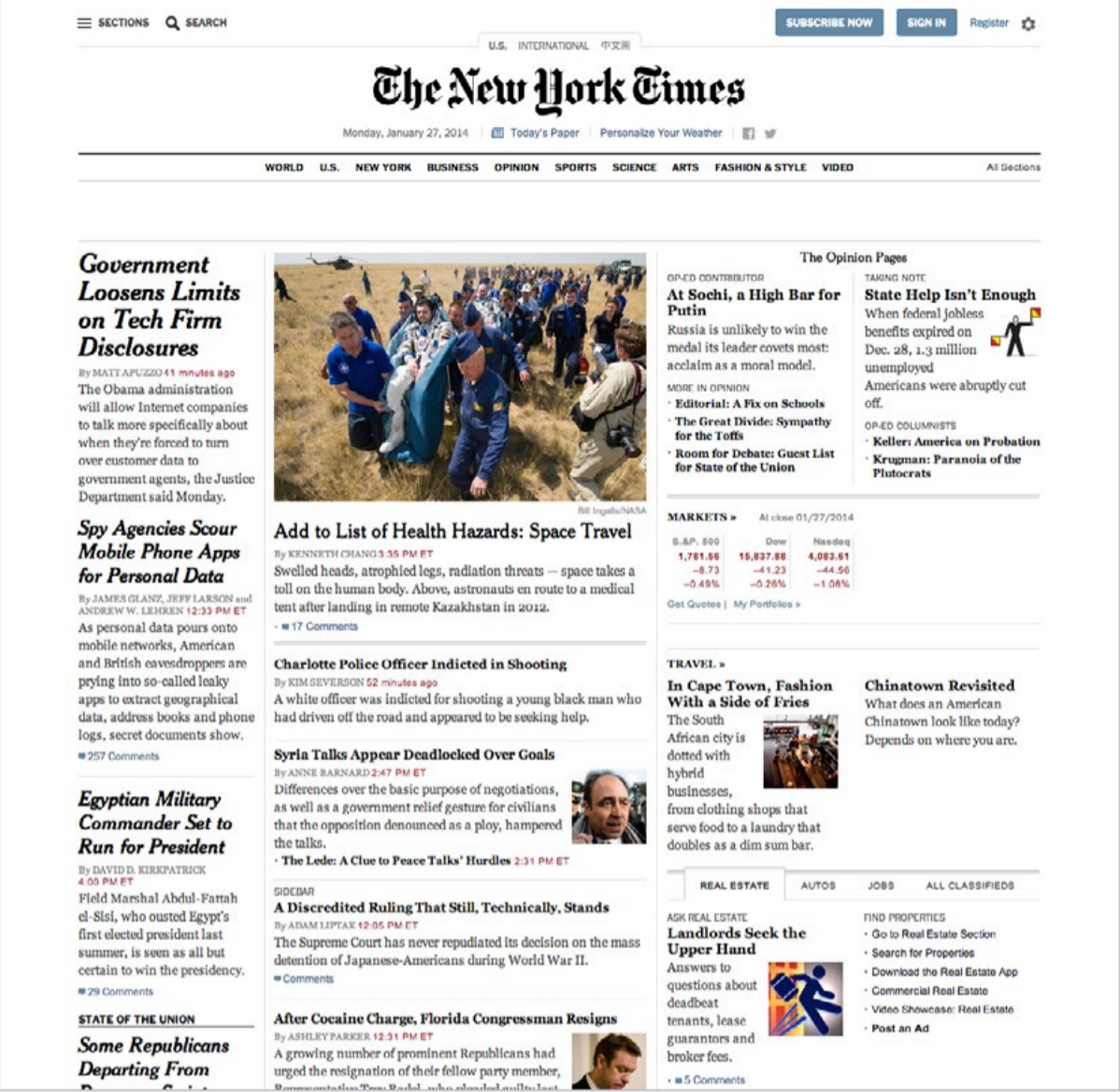
- Once you have your building blocks accounted for, you can assemble your typographic system and then focus on hierarchical relationships. Which elements are most important? What relationships do elements share? To figure this out, you can look at the markup and see what the semantic structure looks like. An h1 is likely our biggest and most important text, and then down the line to h2, h3, and so on.
- That’s fine for text, but what about navigational elements, images, and other kinds of content that need to fit in? Always think about your intent—the things you want a visitor to do—and use that to influence your visual styling.
- If you want someone to read an article, focus your efforts on styling the text. Make sure it’s nice and readable, with a clear entry point—like a big, appealing headline that shepherds readers into the article.
- If you want someone to watch a video or register for an account, focus on making those elements shine. They don’t need to be the biggest items on the page, but they should have enough heft and visual prominence through placement and color to draw attention.